5 Steps to Improve the User Experience of Your Website
- August 24, 2022
Considering the enormous number of websites on the web, it comes as no surprise that attracting and keeping visitors on a page has become significantly more challenging.
As you are reading this, you may even remember your own bad experiences with terrible website UX that causes you to become totally lost and click “exit.” You don’t want that for your own website.
Yes, the user experience of your webpage is vital. Often, to achieve desired results, we turn to designers. Good use of UX-oriented design principles helps to create a seamless browsing experience. This is always easier to put into words than it is to do in practice.
When browsing some of the top websites, the experience feels seamless, almost intuitive at first sight. That is primarily thanks to the web designers behind those designs, but it is not entirely fair to compare or compete with top-class sites. However, it is reasonable to use the resources that you have to improve your own website UX.
One of the key things about truly refined design is that it doesn’t make the user question the intent behind a particular element or feature. If visitors who come to your website have to scroll up and down to figure out how to move forward with their needs, your design is not living up to professional standards.
A well-designed page will feel natural, often intuitive. So, the question is – how do you get there, and what are the most essential UX aspects to cover in any design project? Let’s take a look.
#1: Create a Consistent Design Experience
User experience design doesn’t only apply to a landing page or the signup form. UX design encapsulates your entire website and application design so that all of the pages feel connected. It’s confusing for a user to browse your site only to face different variations of page designs, which can easily conceal the overall browsing experience.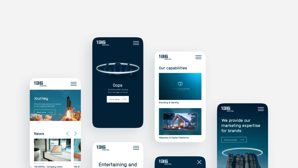
This is even more relevant now with the current focus on mobile-friendly design. A few years ago, not many designers were worried about creating a seamless mobile experience for their users. In contrast, today, you can’t tell the difference between a mobile or a desktop website because both have become interconnected for the sake of providing a consistent user experience.
Things to consider:
Before you decide that you’ve had enough to read and it’s time to act, make a note to consider the following:
- Is the color scheme consistent sitewide, and does it flow throughout all of your pages?
-
Are you using specific keywords to highlight different parts of your design features?
-
Does your mobile website have the same features as the desktop version?
#2: Improve Your Site Navigation
“To be a great designer, you need to look a little deeper into how people think and act.” – Paul Boag, Co-Founder of Headscape Limited.
There are no limits to how good your navigation can be. Regardless of how you improve your website, it will perform poorly if navigation is not fast, direct, and easily accessible. And you can rest assured that users will leave your site/app if your navigation doesn’t provide an effortless browsing experience.
Here is an example of modern navigation principles, as employed by the NYTimes website:
At the very top of the page, users have a few button choices – Sections, Search, and a Settings font-icon on the far right. Putting these elements directly on the header part of the page without masking them would create a much more clutter-free user experience. It’s as simple as avoiding putting too many content choices directly onto the homepage; instead, designers can mask certain areas using modern styling options.
Here is what happens when someone clicks on the Search item:
A search bar expands in the same header area while masking the rest of the page, putting the sole focus on search alone. Just think how much space that search bar would take up if placed directly on the top of a page.
Minor tweaks to your navigation can go a long way towards saving precious design space. In this regard, the concept of less is more makes perfect sense. So, what are some other examples of seamless navigation?
One of the most talked-about UX trends in recent years is personalization, the idea of using user data to deliver a more personal experience. This can be achieved in many different ways.
Medium is a popular content publishing platform, and its design is world-class. Some of the things that Medium does well are content suggestions (as seen above) at the end of each article. These range from related content to pieces stemming from similar parts of the website, all promoting different authors and points of view. Thus, content discovery becomes effortless, while the user can enjoy a more tailored experience.
Some other examples include the likes of Amazon, where the platform carefully analyzes your browsing history and gives you recommendations based on items you have viewed, bought, or added to your wish list.
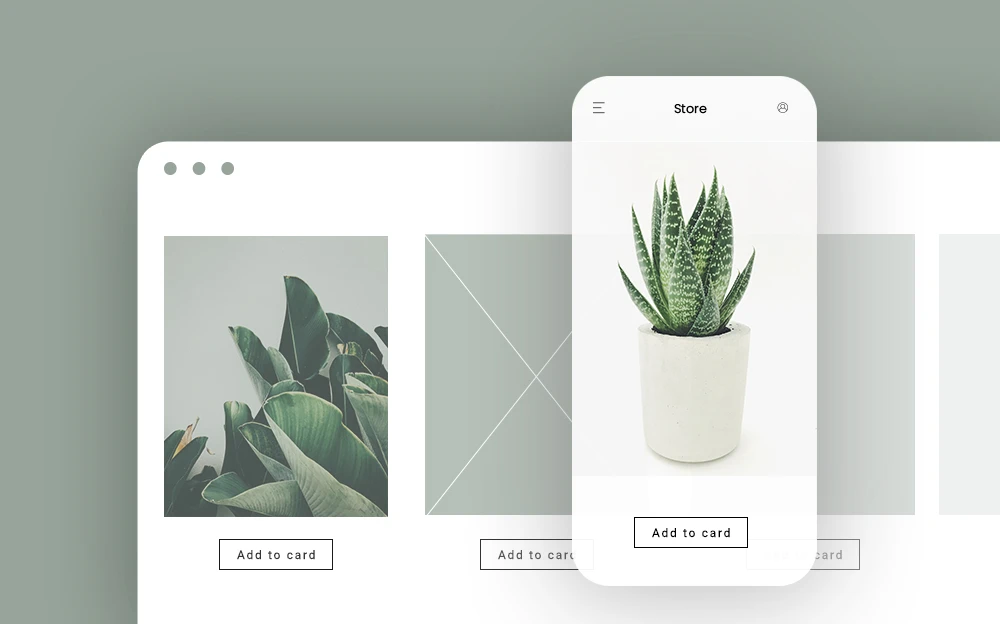
#3: Give Users More Control
-
A website that auto-plays songs or videos? – Nope!
-
A website that shoves a pop-up down my throat in the first 10 seconds? – Nope!
-
A website that wants me to register to use basic features? – No, thanks!
There are many ways to annoy users, but perhaps one of the most distinct ways is the website doing things on behalf of the user. Sure, it’s important to collect email subscribers to generate leads and conversions, but there won’t be anything to collect if you make these features very explicit.
If you have to ‘scream’ at your visitors to sign up, to like you on social media, or to give you their email address, perhaps it’s a good time to rethink your strategy because anyone who appreciates what you are doing and shows interest in your offering is naturally going to do all of those things anyway!
Nowadays, we have full-header popups, annoying pop-unders, and modal boxes that require you to throw a backflip to close the damn thing! It’s a little too much, and many will tell you that they simply leave such sites because of how inconvenient they are.
Why worry about losing visitor attention when you could be gaining it? All that is required is to put the user in charge of how they interact with certain parts/elements of your pages.
Here are some examples:
-
Video Playback: let users decide whether they want to play a video on your page. If it’s a promo, don’t autoplay it, as it can cause an unnecessary distraction for the visitor.
-
Modal Boxes: use a more refined approach to pop-ups, like ‘open at a certain scroll ratio’ or slide the form out of the side of the page. Full-on pop-ups that take over the whole screen are annoying, and people will often leave your site.
-
Ad Blockers: another trend these days is to block users from viewing content on your pages because they have AdBlock enabled. Don’t scare them away entirely by not showing them content. Instead, use a seamless notification in the header/footer of the page to let them know that you’d appreciate it if they turned it off.
-
Basic Features: anything that isn’t part of your premium/paid model should be available for free access at all times. Making everyone register to get a taste of what you have to offer will push people away.
#4: Provide Good Content
User experience isn’t only about design – it’s also about the quality of your content. Ensure your users get key information about what your website is about – whether it’s an online store, service website, blog, or another platform. You want to convey your brand’s story and keep users engaged while they scroll through your website.
The main goal is to inform and engage your users without overwhelming them with too much information, so make sure you know your target audience and what language and style of content they will be most comfortable reading through. Ask yourself the following questions:
-
Is my website content consistent and straight to the point?
-
Does it evoke curiosity in users and encourage them to take action?
-
Is spelling and grammar up to par?
-
Is the length appropriate for the message you are trying to get across?
Make sure to draft your content before posting it on your website, and proofread your content files carefully, so everything is to the highest standard before you publish it. Tools such as Grammarly can be beneficial during the proofreading process and help polish everything up.
#5: Deliver a Fully-Optimized Experience
The main goal of your site is to engage users and encourage them to take action – whether this means getting them to make a purchase, sign up for a service/program, read your blog, contact you, or any other action. If you want to stay ahead of competition, you need to work on delivering a fully optimized website experience. So, what should be included in this experience?
First, ensure that your page load speed is up to par. Slow-loading websites usually have high bounce rates and low conversion rates because no user will be that dedicated to waiting for the loading icon to disappear. Even if your website is designed for the Gods, users will not stick around to browse through it.
Aside from page load speed, your website should also be optimized for mobile devices. It is no secret that the whole world is moving towards predominantly mobile browsing (and even mobile shopping), so ensure that your website has complete mobile optimization to provide users with the option to browse, purchase, and take action via their device.
Moreover, if you are running an eCommerce website, ensure that the customer journey is smooth and intuitive. You don’t want your customers to run into problems at any stage of the buying journey since this will discourage them from purchasing and becoming repeat customers. Every process – from browsing products to checkout – should be straightforward and pleasant for the customer.
UX design is a beautiful hybrid of intuition, creativity, and technical skills. To ensure you are on the right track, put yourself in the shoes of the user. Every time you look through your site, imagine that you are looking at it from the user’s perspective instead of your own. Once you do that, you’ll be able to power up your website UX much more efficiently.