
9 Best Practices of Mobile-Friendly Websites to Implement Today
- August 16, 2022
Mobile-friendly website practices – are they necessary? The short answer is yes, they are vital.
The first quarter of 2019 – January 1st through March 31st – saw that 48.7% of global website traffic came from mobile devices. That should not come as a surprise since internet usage statistics also found that 52.2% of global website traffic in 2018 came from mobile devices, surpassing desktop searches for the first time.
Mobile-Friendly Websites: Then and Now
In 2013, that number was just 16.2%, meaning that traffic from mobile devices more than tripled worldwide during the past six years. Observing this fact, Google began to reward mobile-friendly websites with higher search rankings and penalize those that were not.
Then, in 2018, Google officially announced its Mobile-First Indexing or ranking websites based on their mobile versions, not their desktop version. At this point, a study by Blue Corona found that companies who did not prioritize mobile-friendly versions suffered 50% or more drops in traffic.
Today, more than half of all web traffic is mobile, according to statistics. What is even more interesting is that a recent Ericsson Mobility Report on smartphone analytics predicted a 25% increase in mobile traffic by 2025. To help you understand the big picture better, let’s take a glance at a Hootsuite infographic provided by SmartInsights.

As you can see, mobile usability is on a meteoric rise, and all website owners need to embrace mobile-friendly practices to gain better Google rankings and conversions.
To help you develop a mobile-friendly website, we have compiled this guide of best practices. As a note, keep in mind that the invergetech website/app builder accounts for many of the mobile-friendliness elements we describe in this article. Therefore, think of this guide as more of a “checklist” of tweaks to compare your website against while you design and optimize it.
Mobile-Friendly Websites: Starting the Right Way
First off, what does it mean to have a mobile-friendly website? We have talked about such matters before, but let’s recap! According to Google,
Mobile-first indexing means Google predominantly uses the mobile version of the content for indexing and ranking. Historically, the index primarily used the desktop version of a page's content when evaluating the relevance of a page to a user's query. However, since most users now access Google Search with a mobile device, Googlebot primarily crawls and indexes pages with the smartphone agent going forward.
Google recommends website owners a few best practices to implement when creating mobile-friendly websites. Of course, it is just the tip of the iceberg you see here, as things are more complex. But let’s begin with the obvious:
Avoid software not often found on phones – for instance, Flash.
Use legible, large text – at least 12 pixels on at least 60% of the page.
Employ content that auto-adjusts to screen size.
Add links that are far enough apart to click on each separately.
Now, more than ever, you should improve your website to comply with Google’s Page Experience Update. Experts talk and will talk plenty about Core Web Vitals and page experience signals, but let’s refresh our memory on what it means to have a mobile-friendly, high-ranking, optimized website:
Ensure that the Googlebot accesses and renders your content correctly;
Have the same content on desktop and mobile;
Ensure that the structured data you have on both versions of your site (desktop and mobile) is the same;
Optimize your metadata so it is the same on both site’s versions;
Ads can harm your mobile page rankings, so make sure you follow the Better Ads Standard when you display ads on mobile devices;
Optimize and minimize all your file sizes to improve load time, a ranking factor you should not overlook. When it comes to videos, make sure they are not too large, heavy, or slowing down your mobile pages;
Improve overall page speed;
Make sure the layout and order of content makes as much sense as it does on desktop;
Before you publish website animations, make sure they work just as well on mobile as they work on the desktop version. Also, ensure that Google does not “see” animations on mobile as layout shifts;
Double-check if JavaScript works well on the mobile version, as it sometimes might not;
Disable pop-ups. Google calls them “intrusive interstitials,” but you know it is all about those pop-ups that annoy users and lead to high bounce rates;
When you design or optimize your site for mobile, always have the “fat finger” principles in mind. Touch-screen navigation can lead to unwanted clicks. Ensure your buttons, links, images, etc., are not too big or too small or blocking the path of a thumb trying to scroll.
We will discuss these matters more in detail in a few moments. However, what you need to understand right now is that, essentially, a mobile-friendly website is an intuitive and easy-to-use experience to visit on a smaller screen.
9 Best Practices of Mobile-Friendly Websites
So, here are the primary mobile-friendly websites’ best practices and techniques!
#1: Design with Mobile-First Indexing in Mind
Since Google uses Mobile-First Indexing, it makes sense to use this technique yourself. While most visitors want to see similarities between your mobile and desktop versions – like content, colors, and themes – they will still expect the structure to be different.
The idea is to stick to the essentials only. But what is relevant?
While you could show many different navigation tabs for a desktop site, experts recommend sticking to around 4 to 8 items for a smaller screen. You can save space by eliminating the “home” tab, for instance.
Instead, place your company logo at the top-left of your mobile screen, and make it so that it takes users to the home page when they tap it.
If you need multi-level navigation, keep it simple with a vertically oriented dropdown functionality. Skip Flash – no matter how tempting – as it may not be available on your visitor’s phone. Otherwise, those visitors will not get to enjoy any special effects that you created with the plugin.
Also, as Google and all experts say, be careful with pop-ups. They can be hard to close on mobile devices, resulting in a poor visitors’ experience and high bounce rates.
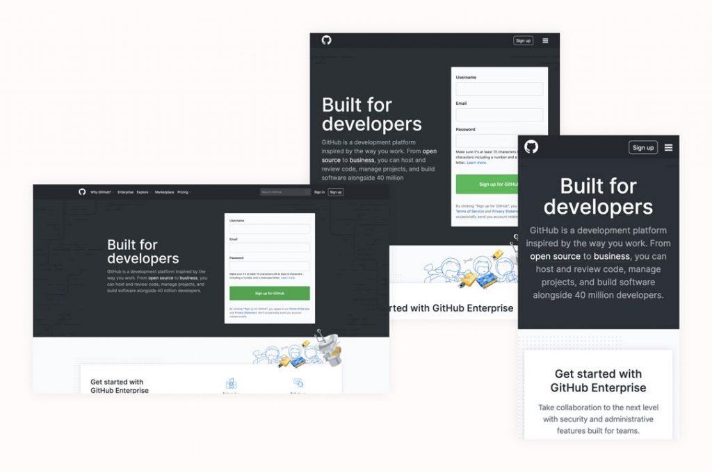
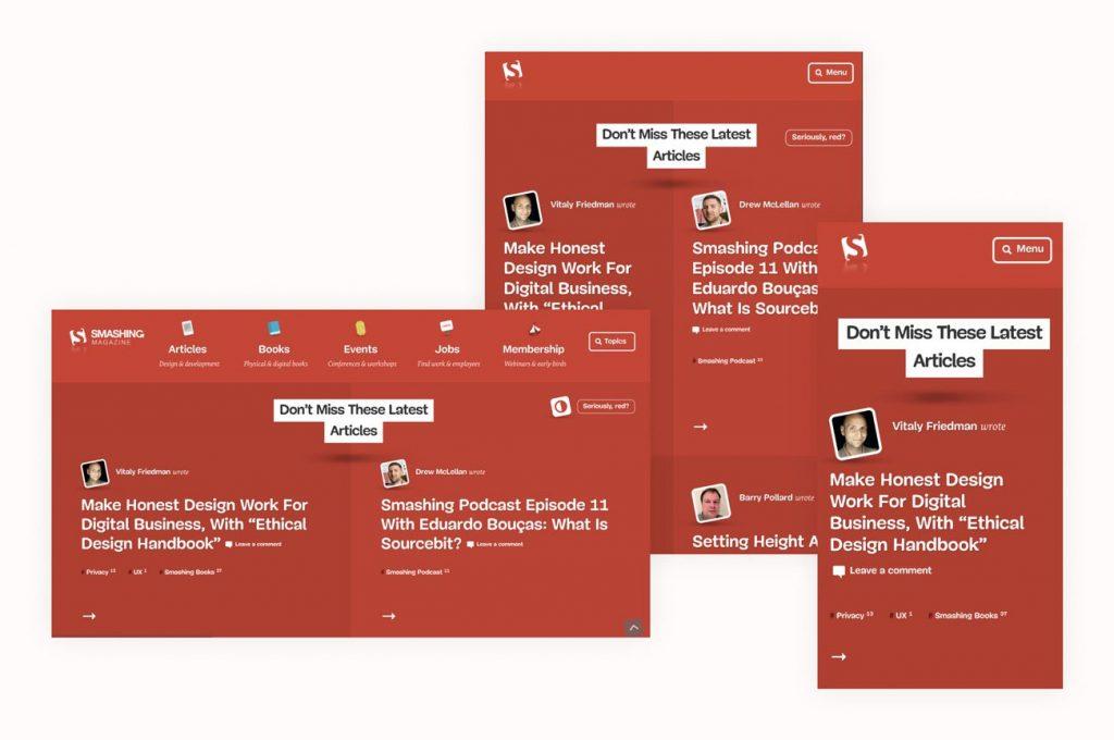
If you take these tips seriously and design your website with a responsive mobile structure in mind, your mobile features will transfer to desktops, making them look the same.
#2: Perform Thorough Research If You Design Mobile after Desktop
If you initially avoided designing your website with mobile in mind, change is a little more difficult but not impossible. Your goal here is to start by gathering data using web analytics tools and UX design tips.
Some questions to ask at this point:
-
What content do visitors find most important?
-
What do they ignore?
-
What path do visitors usually take through your website?
Further, if you use ads for revenue – do not remove them. But if they are a secondary profit method, consider eliminating them on mobile to keep your website fast and clean.
Lastly, run speed tests on different elements of your website. If any elements take a long time to load, consider whether they are critical to the content of your website and whether you can reduce or eliminate them.
For reference – research by Google found that 53% of visitors would leave your mobile page if it takes longer than 3 seconds to load. Now, page load and speed are crucial ranking factors, so do not ignore them!
Your next step is to map out your content paths. A content path is simply a series of experiences that take your visitors to the desired outcome (i.e., a sale) for those who don’t know. You can dig into a deeper explanation and look at some examples here. Then, once you have wireframed them, you can start piecing them together with InvergeTech’s templates.
#3: Write Content with Mobile-Friendliness in Mind
The next best practice tip for mobile-friendly websites has everything to do with content. Namely, writing content with mobile in mind. A common mistake is to squish content or reduce font sizes to fit smaller screens.
Rather than awkward formatting or endless zooming and sliding around the screen, ask yourself what content is most important and how much of it people can easily read and digest on any screen size?
Here are a few suggestions to get started:
-
Add in large, descriptive buttons. Apple suggests a size of 44×44 pts.
-
Increase font size. Choose at least 16px, with a line-height of 1.5.
-
Skip mouse-over and hover effects.
#4: Optimize the Navigation and the Home Page
In addition to minimizing items listed across the top of your website, keep these other factors in mind to help visitors easily navigate across a mobile device.
Very Important Pages
Give visitors the most critical web pages first. Then, if you have a website together with access to traffic analytics, take advantage of it. In addition, ask yourself a few more questions:
- Where are visitors going the most?
- What pages aren’t they visiting?
- If you’re using a silo strategy, which category pages are at the top?
- What actions do smartphone users take most often on your website?
- Which pages on your website take visitors to what they came for most quickly and straightforwardly?
Let your answers guide you in creating new content in an educated manner.
Search = Navigation
If your website is complex – like a largeeCommerce site with many product categories, items, sizes, colors, etc. – consider including a search box rather than additional dropdown menus. So, set up your search bar for different additional search terms and test it to ensure it works.
Navigation should be intuitive.
All the work you’ve been doing so far has made your website intuitive and easy to use. Further, keep the menu language intuitive and straightforward. Some examples include adding a magnifying glass next to your search bar to clarify what that feature’s purpose is. A few stacked lines can indicate a menu. A shopping cart can also indicate what the visitor has decided to buy.
Let’s hear what Google has to say about the home page, navigation, menus, and more:
- Keep calls to action front and center. Make secondary tasks available through menus or "below the fold" (the part of the webpage that people can't see without scrolling down). Make all of your users' most common tasks readily available.
- Keep menus short and sweet. Mobile users don't have the patience to scroll through a long list of options to find what they want. Instead, reorganize your menu to use as few items as possible without sacrificing usability.
- Make it easy to get back to the home page. Users expect to go back to the homepage when they tap the logo (usually placed in the top-left of a mobile page), and they become frustrated when it isn't available or doesn't work.
- Promotions (especially large app install interstitials such as full-page promotions that hide content and prompt users to install an app or download content) should be easily dismissible and not distract from the experience.
Display Your CTAs as Clearly as Possible
Speaking of CTAs, did you know that people should spot CTAs on mobile in less than two seconds? It is what the experts suggest, so businesses have a competitive edge. As you saw above, Google itself recommends you make your buttons visible front and center. While mobile-friendly websites’ best practices encourage you to display calls to action so that anyone can see them and interact with them in the blink of an eye, balance is still key. Do not overwhelm your site with buttons and links, as they will confuse, distract, and annoy people using small screens.
Don’t forget multiple screens.
Your most interested visitors will likely visit your website repetitively and on multiple devices. So, keep your colors and themes the same, no matter the device.
Here are a few more questions to consider:
-
Can your visitors find your essential information, like address, phone number, or email, easily?
-
Should you include a “call” button or store locator on your website?
Let’s see an answer to this last question. What is the best practice of a mobile-friendly website? First, streamline a user’s experience so they can enjoy what you have to offer in as few steps as possible.
In other words, you should take the most advantage of all website interactions on mobile and turn everything into a positive, pleasurable user experience. If you have an eCommerce website or any business relying on people contacting you, the easiest way to provide a seamless marketing funnel and customer service experience is to make it easy for clients to contact you. Here are some tips:
-
Make your phone number a clickable link (Click-to-Call);
-
Clicking your headquarters/shop address should open up a visitor’s Google Maps application (that works!);
-
Add short forms to make it easier for users to contact you or finish a purchase. We will talk more about forms in a few moments.
#5: Optimize Images to Boost Speed
You might feel we are repeating ourselves, and you are not wrong. We do. But for the right reasons, image optimization is one of the hottest topics in web design and SEO.