The Contact Us Page: 7 Examples, Tips, and Best Practices
- August 18, 2022
Communicating with customers is essential for any business. If you care about the audience interested in your products and services, you should have an engaging Contact Us page on your website. Continue reading to get the top tips and examples on how to create a killer Contact Us page and convert your visitors into customers.
You may have heard about the Pareto principle or the 80/20 rule. It means that only 20% of your efforts create the most results and the other 80% are just a distraction. Hence, to be more efficient and achieve better results, you should identify the essentials (the important 20%) of the given aspect and focus your time and efforts on it.
This rule can be fully applied to any website. There are certain pages on your website that are the most crucial in engaging the audience and increasing conversions. Identifying and focusing on those pages should be your highest priority. That’s not to say that you should ignore other website pages, but rather that there are specific pages that require some additional analysis to create.
Today, we want to go through one of those MOST important pages on your website, the Contact Us page, and give you the top tips, best practices, and examples of making it super visitor-friendly.
So let’s get to it!
Top 7 Best Practices to Create a Killer Contact-Us Page – With Examples
When we consider building great business websites that keep customers coming back, we usually pay attention to the home page, product/service pages, the blog, etc. But how many spend time fine-tuning the copy and the design of the contact us page? Adding a form with the help of your website builder is usually enough for most brands, but the contact page is more important than you can imagine. So let’s see some top tips, best practices, and examples of Contact Us pages that make a difference!
1. Pay Special Attention to the Contact Us Page Design
A well-designed and attention-grabbing contact page is crucial for converting visitors into customers. Are you designing your contact page? Remember that it should (ideally) fit the website’s overall design and comply with your brand’s image, message, and identity. However, it’s always best to keep the Contacts block relatively simple to avoid confusion.
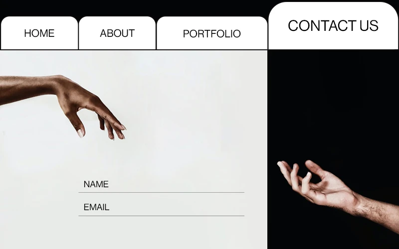
Great example with great design: Indofilio
2. Make Your Contact Page Easy to Find!
Even if you have a brilliantly designed Contact page, it becomes useless if users cannot find it easily on your website. Don’t make your users look for it! Research shows that 87% of users expect to find the link to the Contact page on the top right-hand corner of your website’s header or in your footer. The header works best.
Great example: Whole Design Studios
3. Give Users the Right to Choose
When creating a Contact Us page, show all the alternative ways of contacting you to satisfy each customer’s needs. A short form to understand who is reaching out to you and why it is crucial, but you should look beyond it. Ideally, you should display other elements too:
Your company address – Showing your place on Google Maps will also be helpful in the case of local businesses.
Telephone number with area code – Include all departments and contact names if necessary. Some businesses also display photos of the customer service team members to build trust and authority.
E-mail – Show your business e-mail addresses to reach you for press, sales, or other types of inquiries. Don’t forget to enhance your security and spam protection.
Social Media links – Your visitors might want to connect with you on their favorite social network.
Working hours – You may also include info telling when you are open or closed.
Fantastic example: Moosend
4. Simplify Your Contact Form Design
Simplicity in web forms, just as in modern web design, always pays off. The conversion rate falls as the number of fields to be filled in the contact form increases.
This is a fact. Make sure only to include only the fields that need to be there – no more, no less.
To avoid frustrating your visitors, follow the rules of thumb:
Don’t ask your visitors to enter their e-mails (or other information) twice. They won’t like it.
Send an automated confirmation e-mail to tell your visitors you have received their letter and reply as soon as possible. You may also include a copy of the submitted message in the confirmation letter.
Include only required fields in the form.
Check and display errors while the user is writing, not after submitting.
Personalize the confirmation letter using the information provided by the user. For instance: Hi Robert, we have received your message and will get back to you soon!
Don’t overdo with captcha. A simple box check or a math question is way better than unclear letters and numbers.
Place the form fields vertically instead of placing them side by side. It reduces the number of eye movements your visitors make while filling out the form.
Don’t overload the page with irrelevant links and banners to keep your visitors super concentrated. According to our user-testing experience, every second of distraction prevents the user from filling the form. The last thing you want from your Contact Us page is to keep the user looking through news feeds, following the links to the website pages, and not finish filling out the form.
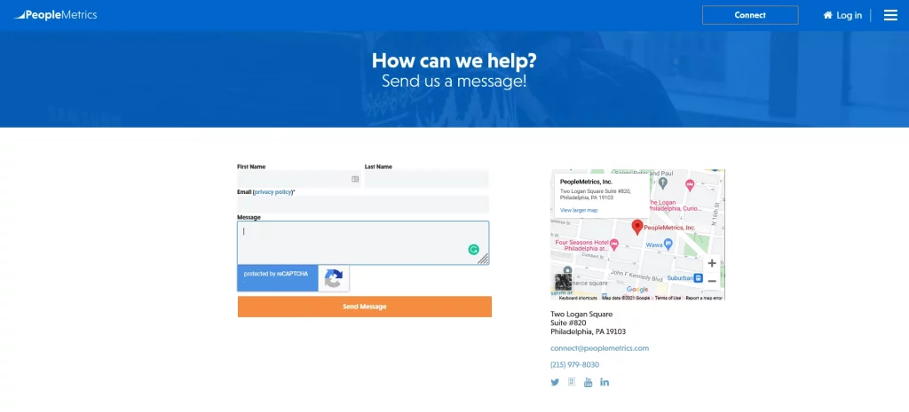
Awesome example: PeopleMetrics
5. Build Your Contact Us Page as a Landing Page Aiming for Conversions
Building a Contact Us page to generate leads should follow the best practices of creating a high converting landing page. A contact page is a landing page in its own right, so if you need to refresh your memory, here are some tips for you!
1. Write short and compelling content on your Contact Us page. You don’t need to overdo things. However, be clear and precise in your copy. For example, tell your visitors why they should contact you, what problems you can solve for them, what they should expect in return for contacting you, etc.
2. Write an attractive call to action. Go beyond the classic “email us now,” as it might seem like you directly collect users’ emails for some reason. Try a call to action that matches your brand’s personality. Here are some examples:
-
Let’s chat.
-
Reach out.
-
Get in touch.
-
Drop us a line.
-
Contact us for [offer/support] today.
3. Make sure you find the right balance between a slick, modern design, catchy color schemes, and visible, clickable CTA buttons. Just as it goes with landing pages, one CTA button leading the user to a unique path is the best practice you could implement.
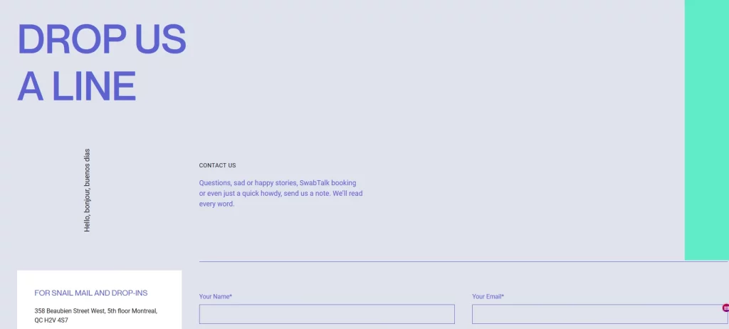
Awesome example: Swab the World
6. Personalize the Page as Much as You Can
Some people use contact pages and forms to get answers to their questions or solutions to their problems. So how about splitting your contact page into several sections to personalize it specifically to your users’ needs?
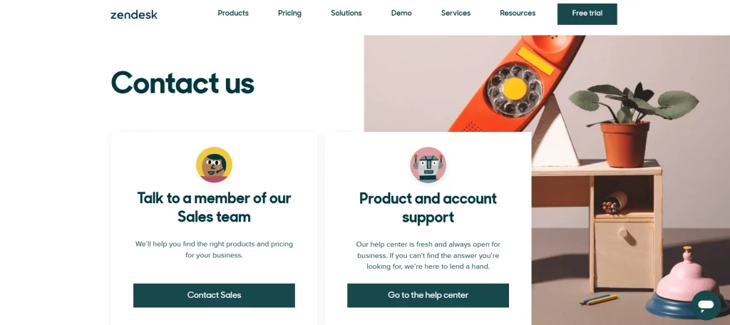
Zendesk is a good example of excellent user service and experience. People can contact a real sales representative if they choose to or find answers to their issues in the help center. In a world dominated by chatbots, FAQ sections, and extended online guidelines, speaking with a real human occasionally is a great way to serve your user base.
Depending on your user persona, you can personalize your contact page by interactively offering drop-down menus to merge the help center and customer support with the contact form.
Great Contact Us page example: Zendesk
7. Optimize Your Contact Page for the Better!
Don’t forget to analyze the experience of your visitors trying to contact you using Google Analytics or a heatmap and visitor recording tools, like Hotjar. This will give you a better understanding of further optimizing your contact page to make contacting you an easy and engaging user experience.
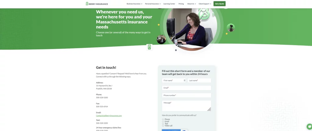
Before we leave you to your Contact us page, we will analyze a final example of an amazing page that does a lot of good things for the users (and the business clients):
-
Clear copy of how the page serves the users: they can contact the company to learn more about insurance in Massachusetts.
-
They display images of real people in real offices instead of stock photos or vectors.
-
The company offers users multiple contact choices – email, phone, chat with a real person, contact form, etc.
-
An excellent idea is giving users a timeframe for getting a response back – 24 hours. Telling your visitors when they can expect an answer for you creates trust and a flawless user experience. In our digital world, filling a contact form makes most people feel like their messages do not reach anyone and never receive an answer. This insurance company ensures users tend to their communication needs in a professional, timely manner.
-
Looking further down the page, you will notice the company also displays working hours, a 24-hour emergency claims phone number, a video call option, and more.
-
Scrolling down the page, you will also find a list of key people in the company if you want to talk to someone specifically (for instance, the company’s vice president or the content marketing manager).
Awesome example: Berry Insurance
Final Thoughts
Creating a Contact Us page is not an easy feat, especially if you want to build a meaningful and trustworthy relationship with your customer base. However, the more people are willing to contact you, the more leads and customers you will have. We hope our Contact Us page examples helped you better understand how to start building this page for your website.